
We just shipped the new version of Rankry. It is no longer a tool that only shows you analytics. It now runs the full loop: it measures where you stand in AI search, diagnoses why, and hands you a plan to fix it.
So we did the obvious thing. We pointed it at our own brand.
The verdict was humbling. Our Rankry Score came back at 3 out of 100. That is not a typo. Across 255 AI responses to real buyer-intent questions in our category, Rankry showed up in exactly one of them.
We are not hiding that number. We are going to do the opposite. We are going to use this exact dashboard to grow our own AI visibility in public, and show you every move and every result along the way.
This first article is a tour of that dashboard, using our real data. By the end you will know how to read your own AI visibility in about 30 seconds, and what to look at first.
What the dashboard is actually for
Most AI visibility tools have the same problem. They give you a wall of numbers and leave you to figure out what any of it means. You end up staring at charts trying to guess what to do on Monday.
We rebuilt the dashboard around the opposite idea. Its job is to answer two questions before you scroll: where do I stand, and what do I do next. Everything on the screen is pointed at those two answers.
Here is what that looks like in practice.
The 30-second brief
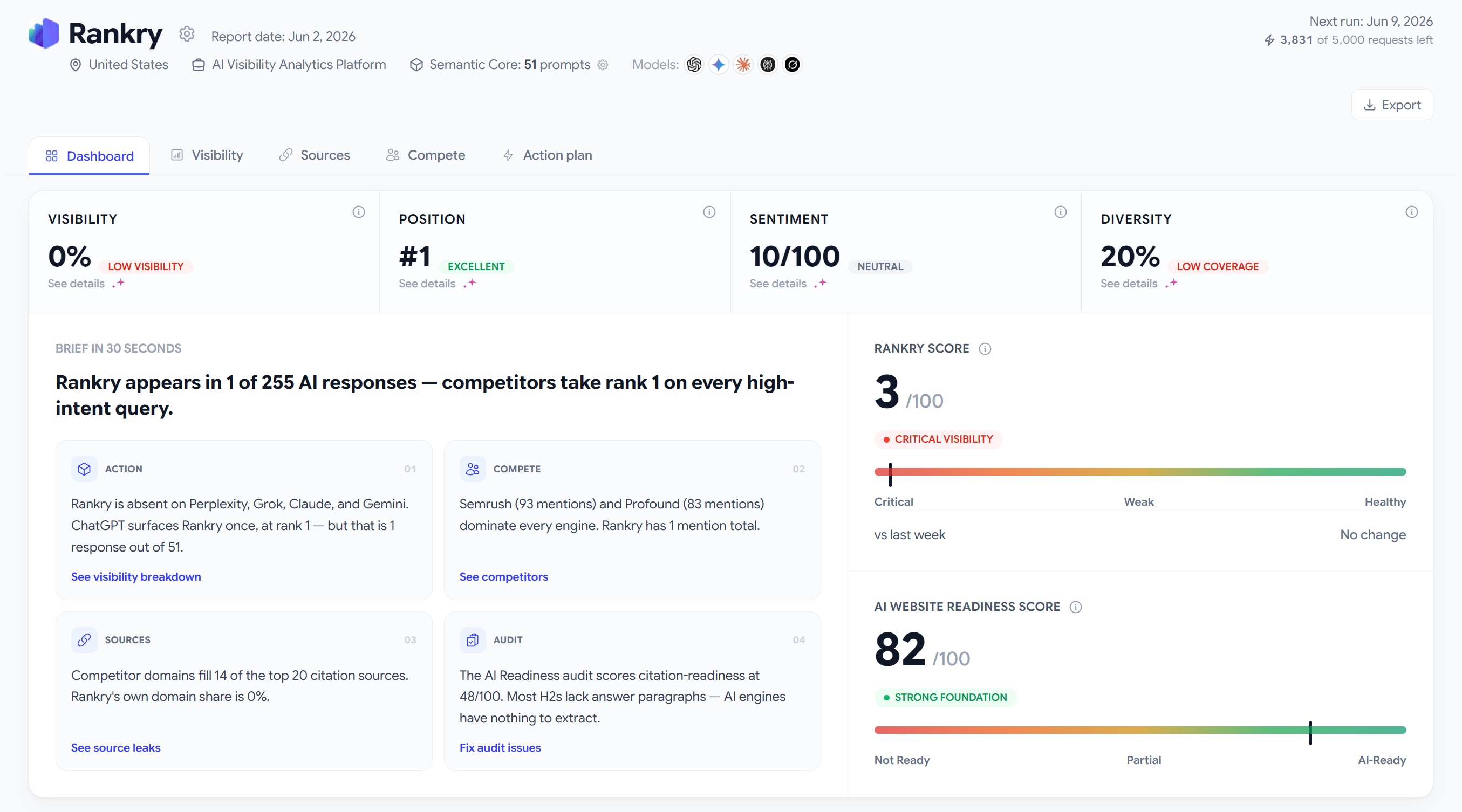
At the top of the dashboard is a plain-English headline that sums up your entire situation in one sentence. For us, it read: Rankry appears in 1 of 255 AI responses, and competitors take rank 1 on every high-intent query.
Below it sit four cards, each pulling the single most important fact from a different part of the product:
The Action card told us Rankry is absent on Perplexity, Grok, Claude, and Gemini. ChatGPT surfaces us once, at rank 1, but that is one response out of 51.
The Compete card told us that Semrush, with 93 mentions, and Profound, with 83, dominate every engine. Rankry had one mention, total.
The Sources card told us competitor domains fill 14 of the top 20 citation sources, and our own domain share is 0%.
The Audit card told us our citation-readiness scores 48 out of 100, because most of our H2s have no answer paragraph underneath them, so AI engines have nothing clean to extract.
That is the whole story in one read. No digging required. Every card links straight into the section it came from, so the moment something catches your eye, you are one click from the detail.
The four numbers at the top
Under the brief are the four core metrics. The trick is to read them together, not one at a time.
Visibility is how often you actually appear in AI answers. Position is your average rank when you do appear. Sentiment is how positively the engines describe you. Diversity is your coverage across the five models.
Our numbers made the point perfectly. Position came back as #1, which looks great on its own. But Visibility was 0%. Put those side by side and the real picture appears: when we show up, we rank first, but we almost never show up. A single metric in isolation lies to you. The four of them together tell the truth.
Why there are two scores, not one
This is the part that confuses people at first, so it is worth slowing down.
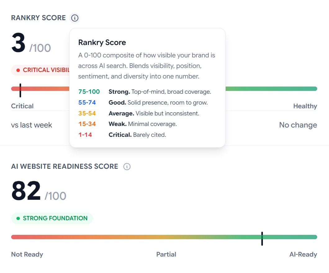
The Rankry Score is a 0 to 100 number that blends visibility, position, sentiment, and diversity into one figure. It answers a simple question: how visible is your brand across AI search right now. Roughly, 75 and up is strong, 55 to 74 is good, 35 to 54 is average, 15 to 34 is weak, and anything under 15 is critical. Ours was 3.
The AI Website Readiness Score is a completely different thing. It grades how well your site is structured for AI crawlers to read, extract, and cite you, across 36 checks in six areas: crawl, rendering, identity, architecture, citation, and authority. It answers a different question: is your site even capable of being cited in the first place.
Here is why keeping them separate matters. Our Website Readiness Score was 82, a strong foundation. Our Rankry Score was 3. In other words, our site is technically in good shape, but we are still barely being recommended. Being ready to be cited is not the same as being cited. Most brands look at one number and assume it covers both. It does not. The gap between these two scores is usually where the real work lives.
This week’s plan
A diagnosis with no next step is just bad news. So the dashboard ends with a short, prioritized list of moves, generated from the findings above and ranked by impact.
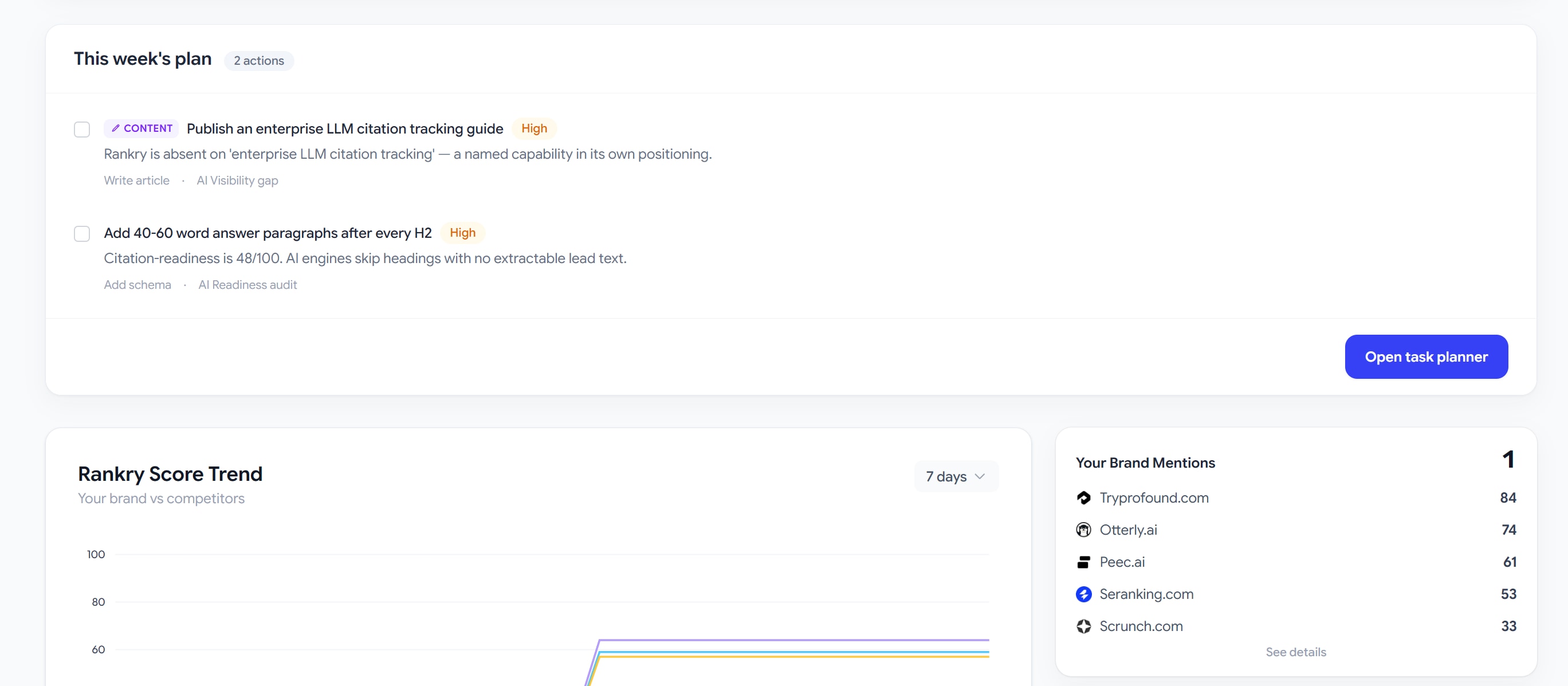
Our plan had two high-priority items. The first: publish a guide on enterprise LLM citation tracking, because that is a named capability in our own positioning that we were completely absent on in AI answers. The second: add 40 to 60 word answer paragraphs after every H2, because our citation-readiness was 48 and engines were skipping our headings with no lead text to pull.
Each item carries its source, so you always know which finding it came from. One button drops the whole list into the Task Planner, where your team can assign it, work it, and close it without leaving Rankry.
Trends and the model breakdown
Lower on the dashboard, two things put the snapshot in motion.
The trend charts show your Rankry Score and your visibility over time, plotted against your competitors. Ours showed the rivals climbing past 60 while we sat near the floor. Uncomfortable to look at, but exactly the kind of thing you want to watch move week over week.
The model comparison table breaks every metric out by engine. Ours showed ChatGPT giving us 2% visibility and Claude, Gemini, Perplexity, and Grok all sitting at 0. That tells us precisely where the holes are, so we are not guessing which engine to work on first.
The dashboard is a map, not the whole trip
Everything on this screen is a starting point. The brief cards, the metrics, the scores, the plan, they all link deeper into Visibility, Sources, Compete, and the Action plan, where the real detail lives. The dashboard’s job is to point you at the right one fast, so you spend your time fixing instead of hunting.
We will walk through each of those sections in the next articles in this series.
The honest part
Our number today is 3 out of 100. We could have shown you a polished demo with green numbers everywhere. Instead we ran the tool on ourselves and showed you the real thing, because that is the whole point of building it.
Now we are going to work this dashboard, the same one you just toured, and grow our own AI visibility out loud. We will report what moved, what did not, and what we learned. If you want to see whether a 3 can become a 63, follow along.
And if you would rather see your own number first, it takes about five minutes to set up.