Run a single buyer prompt 500 times, recording which brand lands the #1 spot each time, and the answer stops being a name and becomes a distribution. In the modeled dataset used throughout this guide, 12 different brands were ranked first at least once, and the most frequent leader held #1 in only about 19% of runs, meaning the top spot changed roughly 4 runs out of 5. No brand owned the answer. This is not the abstract point that “AI has variance”, it is the exact shape of that variance for one question: how many brands win, how often the leader holds, how wide the spread is. The practical lesson is that “who ranks #1” is a distribution, not a fact, so a one-time check is one draw from a wide range presented as a measurement, and your real position is your presence rate across many runs. Here is what 500 runs showed.
Note on the data: the figures in this guide come from an illustrative, modeled dataset, not from live runs, and they are labelled as such in every chart. The shape of the distribution is the takeaway; the exact percentages in your category will differ, and the last section shows how to measure them on your own brand.
One question, 500 runs, 12 winners
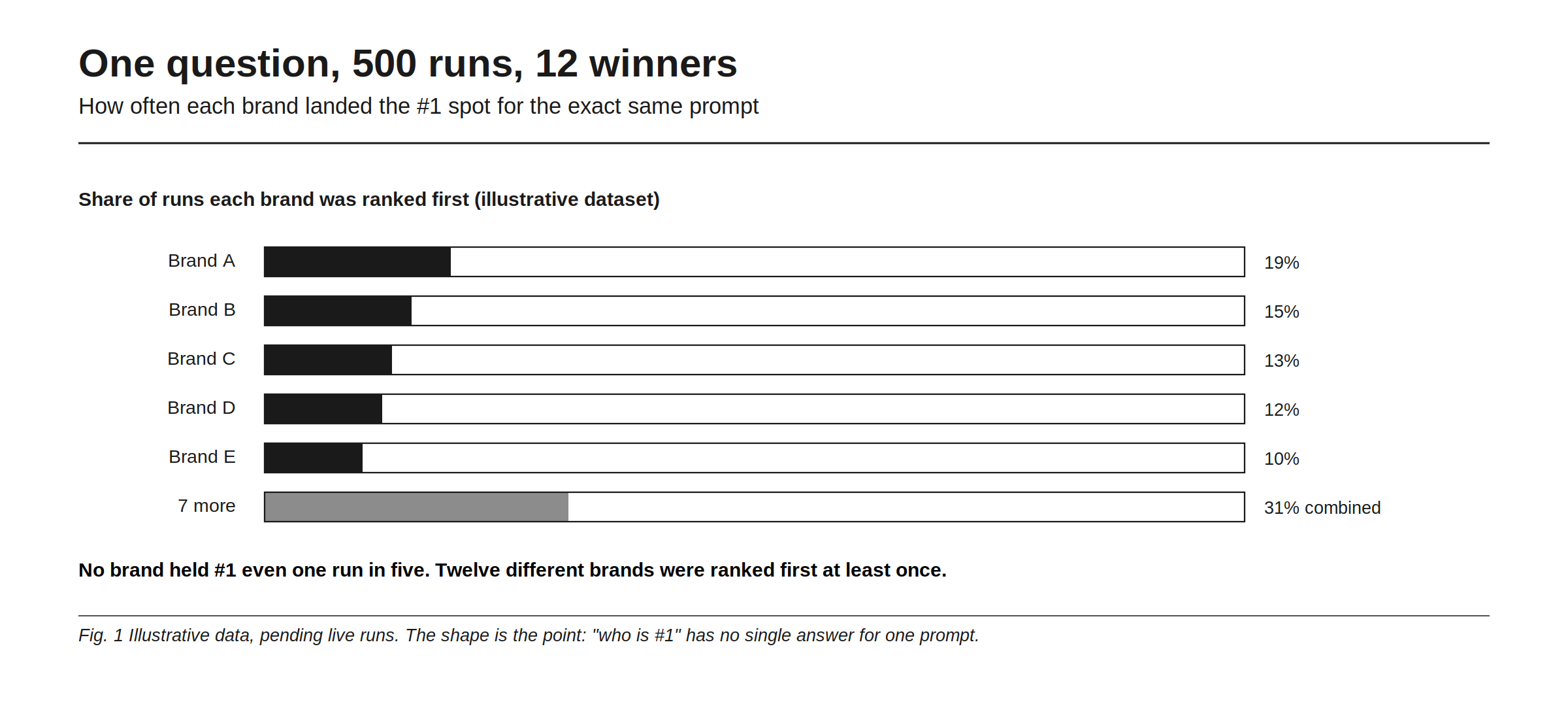
The model behind this guide takes one decision-stage question, runs it 500 times, and logs the first brand named each time. Twelve different brands were ranked first at least once. The most frequent leader took the top spot in roughly 19% of runs, the next in about 15%, then 13%, 12%, and 10%, with the remaining seven brands splitting the rest. Read that top line again: the single most dominant brand for this prompt was #1 less than one run in five.
That is the number worth sitting with. It is tempting to summarize this as “there’s randomness,” but the specific magnitude is the finding: not two or three plausible winners, but twelve, and not a leader that holds most of the time, but one that holds nought but a fifth. Why a single number can hide this much spread is the mechanics covered in why two trackers never show the same number, and why so many runs are needed to see it clearly is in how many runs a number needs before you can trust it.
The #1 spot changed 4 runs in 5
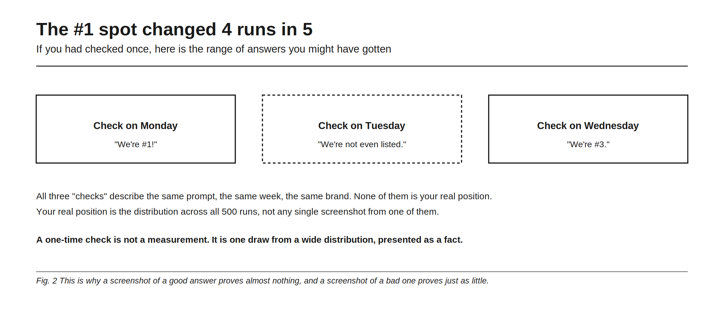
Now imagine you had checked once. Check on Monday and you might see “we’re #1.” Check on Tuesday and see “we’re not even listed.” Check on Wednesday and see “we’re #3.” All three describe the same prompt, the same week, the same brand, and none of them is your real position. Your real position is the distribution across all 500 runs, not any single screenshot from one of them.
This is why a one-time check is not a measurement, it is one draw from a wide distribution presented as a fact. A screenshot of a good answer proves almost nothing, and a screenshot of a bad one proves just as little. The day-to-day churn people notice is the same phenomenon from a different angle, explored in why AI recommendations change overnight. The 500-run view is what turns that churn from a mystery into a measurable spread.
What the 500 runs actually teach
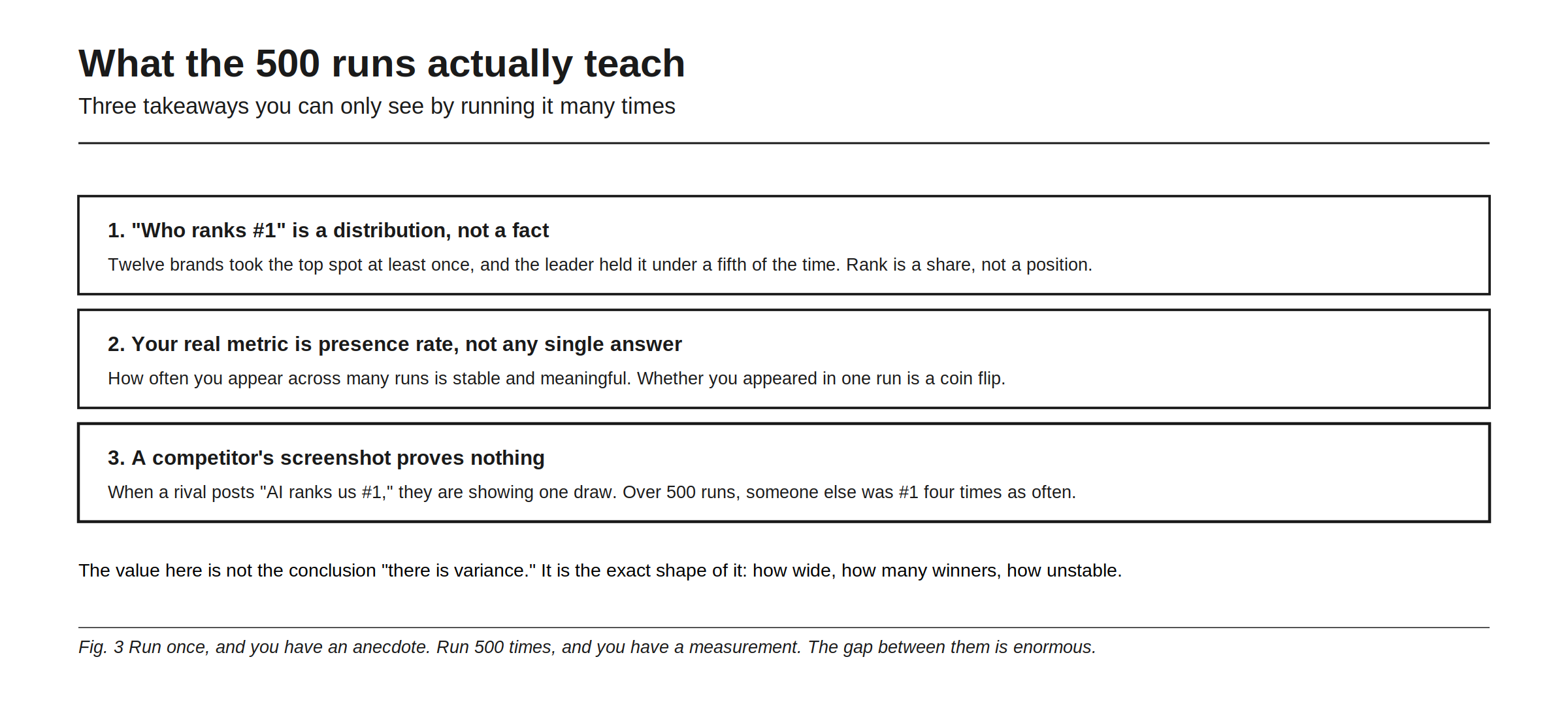
Three takeaways survive the noise, and you can only see them by running it many times. First, “who ranks #1” is a distribution, not a fact: twelve brands took the top spot at least once and the leader held it under a fifth of the time, so rank is a share, not a position. Second, your real metric is presence rate, not any single answer: how often you appear across many runs is stable and meaningful, while whether you appeared in one run is a coin flip. Third, a competitor’s screenshot proves nothing: when a rival posts “AI ranks us #1,” they are showing one draw, and over 500 runs someone else was #1 four times as often.
The value here is not the conclusion “there is variance.” It is the exact shape of it, how wide, how many winners, how unstable. Run once and you have an anecdote; run 500 times and you have a measurement, and the gap between them is enormous. This same 500-run dataset, viewed across engines instead of within one, reveals which engine spreads recommendations widest, which is the companion piece which engine spreads recommendations widest.
Why this matters more than it looks
It is easy to read this as a curiosity and move on, but it quietly rewrites how you should run your entire AI visibility program. If the top spot for one prompt has twelve possible winners and a leader who holds a fifth of the time, then every decision you make off a single check is built on a coin flip. You would celebrate a win that was luck, panic over a loss that was noise, and mis-report both to your team. The only honest unit of measurement is the rate across many runs, your presence rate, your share of the #1 spot, your distribution, because those are stable while any one answer is not. That is the difference between managing your AI visibility and reacting to screenshots of it. Rankry runs each prompt many times and reports the distribution, so you see your true presence rate and share, not a single lucky or unlucky draw, from $99 a month on a no-card trial.
FAQ
Why does the same AI question give different top brands each time? Because AI outputs are probabilistic, so the same prompt samples a different answer each run. In the modeled 500-run distribution, twelve brands were ranked first at least once and the leader held the top spot only about a fifth of the time. Variation is the norm, not a glitch.
Does a single AI answer tell me my real ranking? No. A single answer is one draw from a wide distribution. You might see “we’re #1” one run and “not listed” the next for the same prompt. Your real position is the rate across many runs, not any one screenshot.
How many times should I run a prompt to trust the result? Enough that the rate stabilizes, which typically means many runs, not one. A single check is an anecdote. The presence rate and share across a large sample are the stable, trustworthy numbers.
A competitor posted a screenshot showing AI ranks them #1. Is that meaningful? Barely. It shows one draw from a distribution. In a 500-run test, several brands each held #1 in only 10 to 19% of runs, so someone else was #1 far more often than any single leader. One screenshot proves almost nothing.
What should I measure instead of a single ranking? Measure your presence rate (how often you appear across many runs) and your share of the top spot, per engine. These are stable and comparable over time, unlike any individual answer, which is essentially a coin flip.
Run every prompt many times and see your true presence rate and share of #1, not a single lucky screenshot. Start a free 7-day Rankry trial, no card, first report in two minutes.